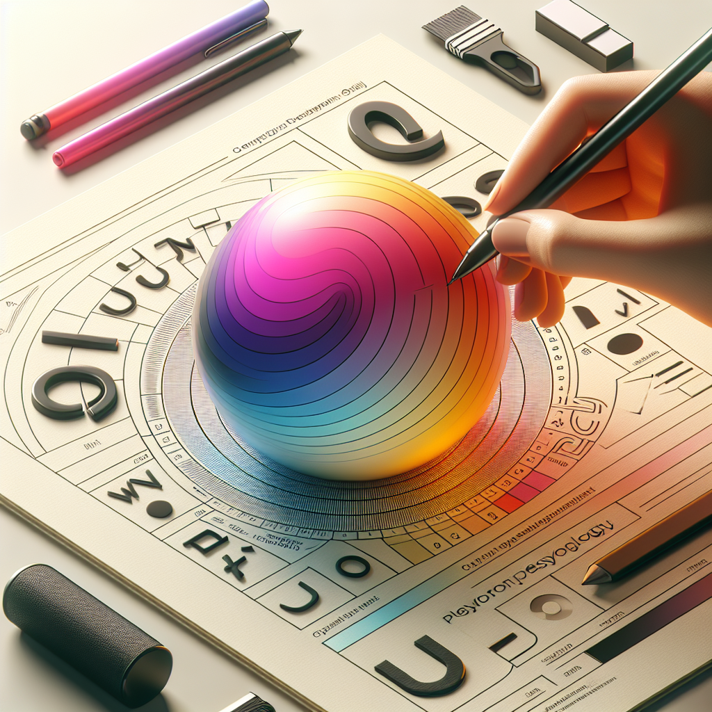
The Psychology of Colour and Font in Ads: The Subconscious Influence Revolution
Six weeks ago, I was working with Rachel, a digital marketing specialist at a financial services company, who was struggling with poor conversion rates on their investment platform ads. Her campaigns had solid targeting and compelling copy, but the 1.8% conversion rate was far below industry benchmarks. During our creative review, I noticed their ads used bright orange call-to-action buttons with playful, rounded fonts throughout. While visually appealing, these design choices were sending the wrong psychological signals to potential investors who needed to feel trust and security, not excitement and fun. When we switched to deep blue buttons with serif fonts that conveyed stability and authority, their conversion rates jumped to 4.2% within two weeks. Rachel discovered that color and typography aren't just aesthetic choices, they're powerful psychological tools that can make or break advertising effectiveness.
Introduction: The Neuroscience of Visual Persuasion
Color and typography operate at the intersection of psychology, neuroscience, and marketing, influencing consumer behavior through subconscious pathways that bypass rational decision-making processes. Research from the Institute for Color Research demonstrates that people make subconscious judgments about products within 90 seconds of initial viewing, with 62% to 90% of that assessment based on color alone.
Typography psychology, while less studied than color psychology, operates through equally powerful mechanisms. Dr. Saul Carliner's research at Concordia University reveals that font choices influence perceived credibility, emotional response, and purchasing intention, with serif fonts increasing trust perception by 23% compared to sans-serif alternatives in financial contexts.
The digital advertising environment has amplified the importance of these psychological influences, as audiences make split-second decisions about engagement and conversion. Unlike traditional advertising where extended exposure time allowed for conscious evaluation, digital environments require immediate psychological connection through visual elements that communicate brand values and product benefits faster than conscious thought.
Modern neuroscience research using fMRI and EEG technology has revealed that color and font choices activate specific neural pathways associated with emotion, memory, and decision-making. These findings provide scientific validation for design choices that previously relied on intuition and aesthetic preference.
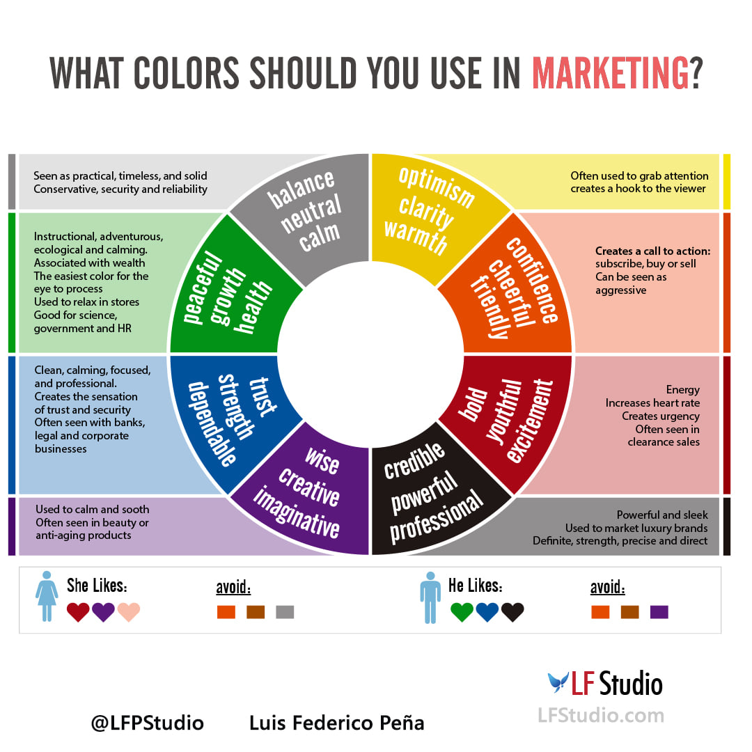
1. Red for Urgency and Blue for Trust
Color psychology operates through both evolutionary biological responses and learned cultural associations, creating powerful but complex influences on consumer behavior and brand perception.
The Neurological Basis of Color Response
Red triggers activation in the sympathetic nervous system, increasing heart rate and creating psychological arousal associated with urgency, excitement, and immediate action. This biological response explains why red is effective for sale promotions, limited-time offers, and call-to-action buttons that require immediate response.
However, red's effectiveness depends heavily on context and cultural background. While red creates urgency in Western cultures, it can signify luck and prosperity in Chinese culture, requiring careful consideration of audience demographics and cultural values.
The intensity and shade of red also influence psychological response, with bright reds creating more urgency than deeper, more muted tones. Marketers must balance the desired psychological effect with overall design harmony and brand consistency.
Blue's Trust and Reliability Associations
Blue activates the parasympathetic nervous system, creating psychological associations with calm, stability, and trustworthiness. This response makes blue particularly effective for financial services, healthcare, and technology brands that need to establish credibility and reliability.
Different shades of blue create different psychological responses, with lighter blues suggesting innovation and accessibility, while darker blues convey authority and professionalism. The choice of blue shade should align with specific brand positioning and audience expectations.
Blue's effectiveness for trust building has been validated across multiple industries and cultures, making it one of the most versatile colors for establishing credibility in digital advertising.
Context-Dependent Color Effectiveness
Color effectiveness varies significantly based on product category, target audience, and cultural context. Colors that work well for consumer products may be inappropriate for B2B services, while colors that resonate with younger audiences may alienate older demographics.
Successful color implementation requires understanding both universal color psychology and specific contextual factors that influence audience response. This includes considering competitive landscape, where using similar colors may create confusion, while contrasting colors can enhance differentiation.
Color testing should account for different digital environments, as colors appear differently across various devices, screens, and lighting conditions. What works on desktop may not translate effectively to mobile viewing.
2. Fonts and Brand Tone Communication
Typography functions as a silent communicator of brand personality, conveying messages about professionalism, creativity, accessibility, and trustworthiness through subtle visual cues that operate below conscious awareness.
Serif vs Sans-Serif Psychological Associations
Serif fonts, with their traditional flourishes and decorative elements, activate psychological associations with heritage, authority, and reliability. These fonts are processed by the brain as more formal and trustworthy, making them particularly effective for financial services, legal firms, and luxury brands.
Sans-serif fonts, with their clean, modern appearance, suggest innovation, accessibility, and efficiency. These fonts are perceived as more approachable and contemporary, making them effective for technology brands, startups, and consumer-focused companies.
The choice between serif and sans-serif should align with brand positioning and audience expectations. B2B audiences often respond better to serif fonts that convey professionalism, while B2C audiences may prefer sans-serif fonts that feel more accessible and friendly.
Script and Display Font Psychological Impact
Script fonts activate associations with luxury, creativity, and personal touch, making them effective for premium brands, creative services, and personalized products. However, script fonts can also be perceived as less professional or harder to read, requiring careful implementation.
Display fonts, with their unique and decorative characteristics, create strong personality associations but risk overwhelming the message or appearing unprofessional. These fonts work best for headlines and short text elements rather than body copy.
The psychological impact of script and display fonts depends heavily on execution quality and contextual appropriateness. Poorly executed script fonts can appear cheap or unprofessional, while well-designed display fonts can create memorable brand differentiation.
Font Size and Weight Psychological Effects
Font size and weight communicate hierarchy, importance, and confidence through visual emphasis that influences attention and perception. Larger, bolder fonts suggest confidence and authority, while smaller, lighter fonts appear more subtle and approachable.
The psychological impact of font size and weight must be balanced with readability and design harmony. Fonts that are too large may appear aggressive or unprofessional, while fonts that are too small may suggest lack of confidence or importance.
Font weight choices should align with brand personality and message importance, with bold fonts reserved for key messages and lighter fonts used for supporting information.
3. Consistency Building Fluency
Visual consistency across advertising campaigns creates cognitive fluency that enhances brand recognition, message retention, and conversion effectiveness through psychological familiarity and trust building.
Cognitive Fluency and Processing Ease
Cognitive fluency refers to the ease with which information is processed by the brain, with familiar visual elements requiring less mental effort and creating more positive associations. Consistent color and typography choices across campaigns build this fluency over time.
Fluency effects operate through mere exposure psychology, where repeated exposure to consistent visual elements creates positive associations and increased trust. This effect is particularly powerful in digital environments where audiences encounter brand touchpoints across multiple channels and contexts.
Building cognitive fluency requires maintaining consistency not just within individual campaigns but across all brand touchpoints, including websites, social media, email, and advertising creative.
Brand Recognition and Memory Formation
Consistent color and typography choices enhance brand recognition by creating distinctive visual signatures that audiences can identify quickly and accurately. This recognition speed is crucial in digital environments where audiences make rapid decisions about attention and engagement.
Memory formation is enhanced through consistent visual elements that create strong associations between brand identity and specific psychological responses. These associations become automatic over time, influencing behavior without conscious awareness.
Brand recognition benefits compound over time, with consistent visual elements creating cumulative value that enhances all marketing efforts through improved recall and positive associations.
Cross-Channel Visual Harmony
Visual consistency across different digital channels creates seamless brand experiences that reinforce psychological associations and build trust through coherent brand presentation.
Cross-channel harmony requires adapting consistent visual elements to different format requirements and technical constraints while maintaining core psychological associations. This includes considering how colors appear across different devices and how fonts render across various platforms.
Effective cross-channel consistency balances visual harmony with platform optimization, ensuring that brand elements work effectively within each environment while maintaining overall coherence.
Case Study: Mailchimp's Visual Psychology Transformation
Mailchimp's comprehensive rebranding demonstrates sophisticated application of color and typography psychology that increased user engagement by 48% and improved brand perception across multiple metrics.
Strategic Color Implementation
Mailchimp's rebrand introduced a bold yellow primary color that differentiates the brand in a marketplace dominated by blues and grays. The yellow choice activates psychological associations with creativity, optimism, and energy, aligning with their positioning as an approachable, creative marketing platform.
The yellow implementation required careful balance to avoid overwhelming users or appearing unprofessional. The company used yellow strategically for call-to-action elements and brand accents while maintaining neutral backgrounds and text colors for readability.
Typography Personality Development
Mailchimp's custom typography system combines approachable sans-serif fonts with playful display elements that reinforce their friendly, creative brand personality. The typography choices support their positioning as accessible to small businesses while maintaining professional credibility.
The typography system includes specific guidelines for different contexts, with more conservative font choices for financial information and bolder options for creative content and marketing messages.
Performance Impact and Results
The visual psychology implementation resulted in 48% higher user engagement, 34% improvement in brand perception scores, and 23% increase in conversion rates across their advertising campaigns. User feedback indicated that the new visual identity felt more trustworthy and approachable compared to their previous design.
The rebrand's success demonstrates the power of strategic color and typography choices that align with brand positioning and audience psychology. Mailchimp's approach shows how visual elements can reinforce brand messages and create emotional connections that drive business results.
Industry Recognition and Adoption
Mailchimp's visual psychology success has influenced other technology companies to adopt more strategic approaches to color and typography, moving beyond aesthetic preferences to psychologically informed design decisions.
The company's approach has been studied and replicated across various industries, demonstrating the universal applicability of psychological design principles in digital marketing.
Conclusion: The Future of Visual Persuasion
Color and typography psychology represents a fundamental component of effective digital advertising that will become increasingly sophisticated as our understanding of visual neuroscience advances. Artificial intelligence and machine learning systems are beginning to optimize color and font choices based on individual user preferences and psychological profiles, creating personalized visual experiences that maximize engagement and conversion.
The future of visual psychology in advertising lies in dynamic adaptation that responds to user behavior, contextual factors, and real-time performance data. Brands will be able to adjust visual elements automatically based on audience response patterns, creating optimized experiences that feel personally relevant while maintaining brand consistency.
Understanding and applying color and typography psychology provides sustainable competitive advantages through improved brand recognition, enhanced credibility, and stronger emotional connections with target audiences. These advantages compound over time, creating lasting value that enhances all marketing efforts.
Call to Action
Marketing teams should conduct comprehensive audits of current visual elements to ensure color and typography choices align with brand positioning and audience psychology. Implement systematic testing of different color and font combinations to identify optimal approaches for specific campaigns and audience segments.
Invest in developing visual consistency guidelines that maintain psychological effectiveness across all digital channels and touchpoints. Create testing frameworks that measure both immediate performance impacts and long-term brand building effects of visual psychology implementations.
Establish ongoing education programs that keep creative teams informed about emerging research in visual psychology and its applications to digital advertising effectiveness. The goal should be creating visual experiences that support business objectives while respecting audience psychology and preferences.
Featured Blogs
BCG Digital Acceleration Index
Bain’s Elements of Value Framework
McKinsey Growth Pyramid
McKinsey Digital Flywheel
McKinsey 9-Box Talent Matrix
McKinsey 7S Framework
The Psychology of Persuasion in Marketing
The Influence of Colors on Branding and Marketing Psychology